One of the most effective ways to grow your business online is by converting more of your current traffic into subscribers, customers or clients.
Taking the traffic you ALREADY have coming to your site, and turning it into bottom line revenue.
An effective digital strategy involves regularly optimising your website to achieve this.
What are you actually “optimising“?
The most important page on your site in this conversion equation, is the very first page a visitor lands on when they make it to your site. Whether it’s from an ad they’ve clicked, a link on your social profiles or something else entirely. This is referred to as a landing page.
Landing pages serve many different purposes, from capturing contact information such as an email address, to encouraging prospects to lock in an initial scoping phone call, or even converting someone into a paying client on the spot.
So you will most likely have a variety of different landing pages on your site, depending on what goals you are trying to achieve. Each having a very unique and specific purpose.
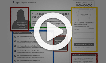
Regardless of what your goals are, the best performing landing pages are made up of pretty much all the same elements.
The great thing is that you don’t have to be a conversion expert to get better results, a few small tweaks here and there can have a huge positive influence on your business.
What makes a landing page effective?
All of your landing pages should answer three questions for a new visitor, and they should do it as quickly as possible;
- Where am I?
- What can I do here?
- Why should I do it?
These three simple questions are a great “acid” test for any landing page.
How can you optimise your landing pages?
If you’re looking to improve the performance of your landing pages, it’s always a good idea to see what other experts and marketers are doing.
By replicating many of the elements and tactics of companies that have invested a LOT of money into testing and optimisation, you can grab a shortcut to better results for your business.
Let’s do that now then, I’ve gathered together 17 killer landing page examples for you to swipe, copy and deploy (a couple we’ve created for our clients).
How do they go passing the three-question acid test?
1. Infusionsoft
Infusionsoft is a CRM and marketing automation software for small to medium sized businesses, it’s in our toolkit here at Marketing Results.
The below landing page is what new visitors see when they first arrive at the Infusionsoft home page;
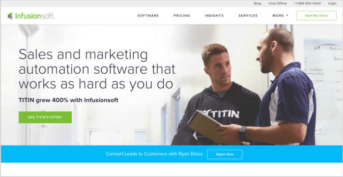
Where am I?
It’s clear to a new visitor that they are on a site that offers “Sales and marketing automation software”, because it is stated in the primary headline.
What can I do here?
On this page, a visitor has the option to “Start My Demo” with a floating call-to-action button in the top right corner of the screen. So they’ve been told what software is available, and they then have the option to take it for a test run.
Why should I do it?
If the sheer fact that “TITIN grew 400% with Infusionsoft” isn’t enough for you, there is many more proof elements below the fold (once you scroll down the screen) that encourage visitors to take this desired action.
What’s good about this landing page example?
- The headline offers a clear benefit for the site visitor. It’s saying, “I know you work hard, how about we offer you some reprieve with this automation software”.
- As you scroll down the page it talks about “Why Infusionsoft” is the right choice. These are what we call differentiated benefits, and encourage more visitors to take action.
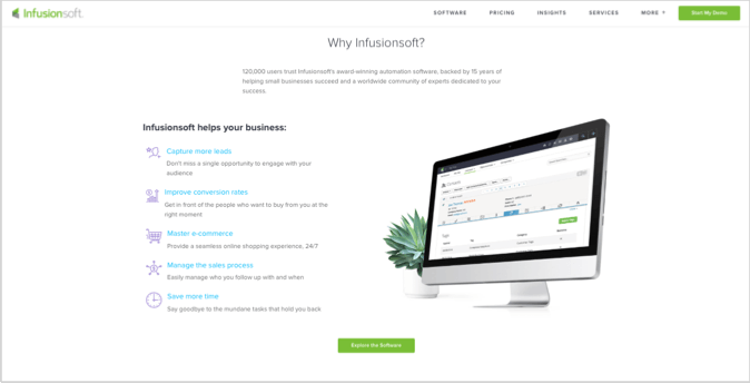
- Another element of this landing page example that makes it good is the clean design, consistent branding, whitespace and use of graphics. These things all contribute to the user experience and trust building process.
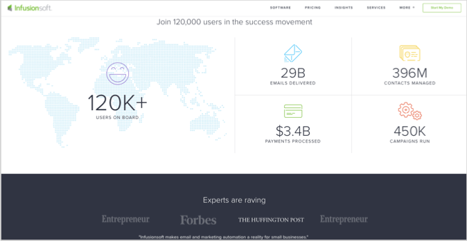
- Towards the bottom of Infusionsoft’s landing page are an array of other proof elements such as user numbers and recognisable publishing logos that build trust with a new prospect.
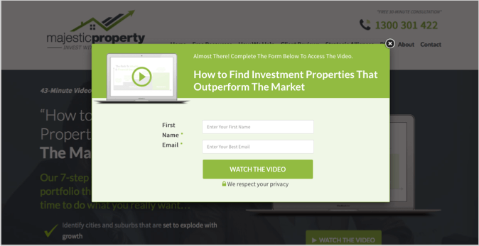
2. Majestic Property
We built the below landing page for a company called Majestic Property. It’s primary goal is to get the contact information of a prospect by offering a video on “How to Find Investment Properties That Outperform The Market”.
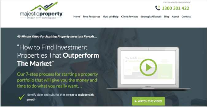
Where am I?
The very first line on this page tells you exactly who it is for… “Aspiring Property Investors”. So if that’s you, you can quickly orientate yourself and be comfortable that you are in the right place.
What can I do here?
There’s no confusing options on this page, it’s very clear to a new visitor that the primary course of action is to watch the video. So if you’re interested in starting a property portfolio, the video is for you. If not, then you’ll know it straight away.
Why should I do it?
As with the Infusionsoft example, the “Why” is further developed as you scroll down the page, however there is enough information in the headlines for you to make a quick decision about whether this is right for you.
What’s good about this landing page example?
- In this landing page example, the headline is extremely specific. There is no chance of confusion, if you are an “Aspiring Property Developer” then this is for you.
- Whilst it can sometimes decrease conversion rates, the use of the “Top Navigation” is important to stay compliant with Google AdWords. So this is something to consider if you are running paid search traffic to your landing page.
- The brand and colour congruency on this page is spot on. The consistent dark blue and green colours used in the logo, on this page and across the rest of the site help build trust and credibility.
- To actually watch the video requires a two-step form opt-in process, as you can see below. We found this two-step process increased conversions significantly for this page.
- As you move down the page it offers a more compelling case for the claims the headlines were making, and the use of graphics and visuals is a great way to enforce these things.
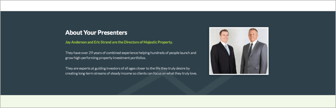
- Personalisation is another effective tactic for increasing landing page conversions, and in this example we decided to build the profile and credibility of the two presenters from the video with personal photos and a short bio. See below.
- You will notice that as well as the call-to-action (CTA) button being prominent in the top section of the page, there is multiple CTAs used throughout. The more opportunity you can give a prospect to take action, the more chance they will.

- Calling out exactly who the offer on the page is for is another great way to influence prospects. It was mentioned in the first sentence on the page, and has been reiterated in a later section.
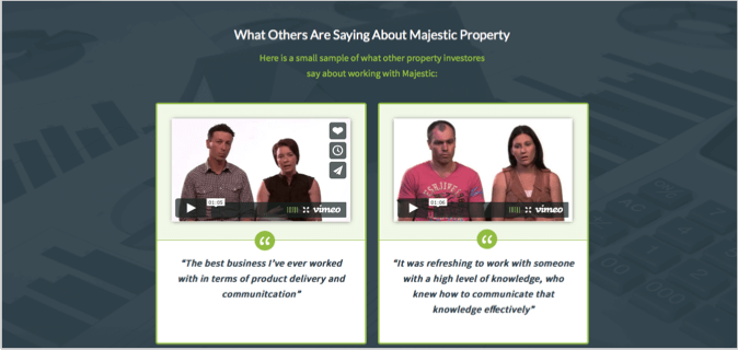
- The last thing that makes this page effective is the use of testimonials as social proof. In this case we used BOTH video testimonials and text-based testimonials. That way even if someone chooses not to click on the video they are able to see the testimonial.
3. Wistia
Wistia is a sleek looking video-hosting platform, that is kind of like the YouTube alternative for businesses. This is their home page;
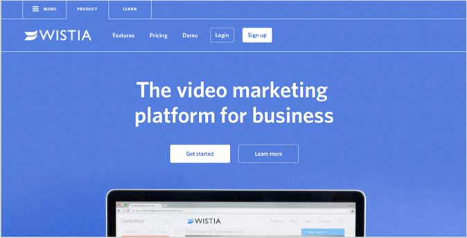
Where am I?
Straight away it’s obvious that a new visitor is at “Wistia”, a “Video marketing platform for business”.
What can I do here?
Now that you know it’s a video marketing platform, if that’s what you are looking for you can “Get Started”.
Why should I do it?
The “Why” isn’t very obvious in the top section of this landing page, they could probably jazz it up with a few proof elements. However, as you scroll down it becomes more obvious.
What’s good about this landing page example?
- They have used what I call a “Fold Teaser”. In this example it is a graphic of the top section of a laptop computer screen. This tactic is really effective in drawing visitors down your page and encouraging them to see what else is there.
- As with the other examples the headline is quite specific, you know what this company does and how they can potentially help you.
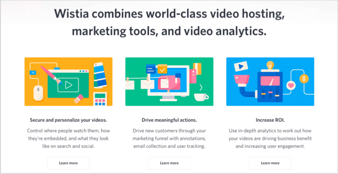
- Further down the page Wistia have used graphics to illustrate the features of their service.
- At the bottom they throw in a bit of social proof in the form of “Join the 200,000 businesses that use Wistia”, which is really important. But if it was me, I’d probably use this piece of proof above the fold.

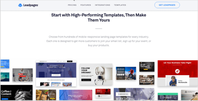
4. LeadPages
LeadPages is a software that offers an easy-to-use landing page builder, and below is their primary landing page.
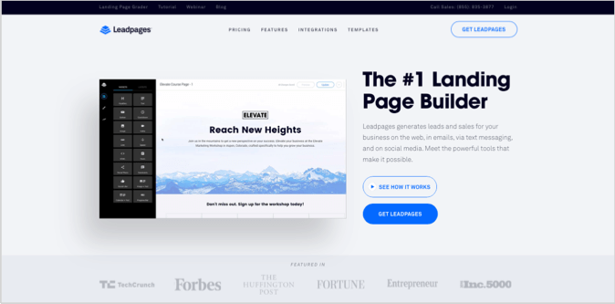
Where am I?
The “LeadPages” logo is prominent in this example and the primary headline helps visitors quickly figure out where they are.
What can I do here?
You have a choice, you can “See How It Works” or “Get LeadPages”. Very simple and compelling options.
Why should I do it?
One of the best things about this landing page example is how well articulated the “Why” is above the fold. The sub-headline states that “LeadPages generates leads and sales for your business…”, which is reinforced with social proof in the form of “Featured In” logos.
What’s good about this landing page example?
- As I mentioned above, the sub-headline is very compelling in this example because it is specific and benefit-driven.
- As you move down the page LeadPages use visuals and thumbnail images to illustrate exactly what you can get if you sign up.
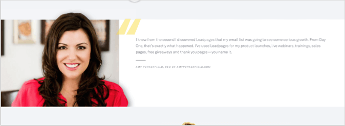
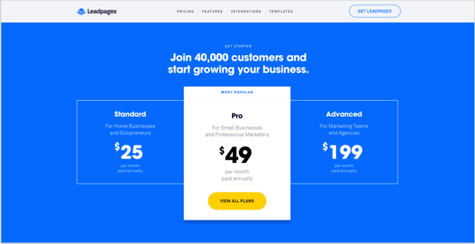
- Social proof elements are used in multiple sections of the page. On top of the “Featured In” panel above the fold, they also have a strong customer testimonial from Amy Porterfield and the statement “Join 40,000 customers…” right above the plan details.
- One final thing to mention with this landing page is how well they have broken up the text with visuals, graphics, headings and easy-to-read statements. The easier it is for a prospect to consume information the more likely they will, and the more likely they will then take action.
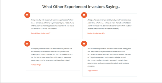
5. Trilogy Funding
Trilogy Funding is a mortgage broker based in Canberra Australia, and this is a landing page we created for them that has been extremely successful.
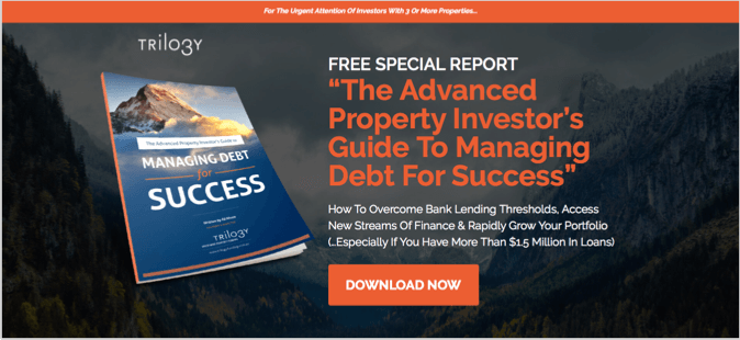
Where am I?
The Trilogy logo is well featured in the top left of the screen, and the heading text “Free Special Report” helps show the prospect exactly where they are.
What can I do here?
There is certainly no confusion about what you can do on this page… The only option is to “Download” the special report.
Why should I do it?
The reason you should download this report is to “overcome bank lending thresholds” and “access new streams of finance”.
What’s good about this landing page example?
- Perhaps the best thing about this example is its hyper-targeted nature. It is directed specifically at “Advanced Property Investors”. Being extremely targeted about your customer group will increase conversions, like it has done with this page.
- Showing a thumbnail or visual of the report someone is about to download, breaks down concerns or barriers with regards to ‘knowing what they’re getting themselves into’.
- The headline and sub-headline clearly articulate the benefit of this lead magnet. Words like “Rapidly”, “New” and “Overcome” are power words in this example that have increased conversions.
- The orange CTA button is hard to miss… This encourages more clicks.
- The simplicity of this page is a primary conversion factor. It’s not too busy, the design is basic, and the action is obvious. You’ll also notice that the primary navigation is missing. As I mentioned earlier, this will significantly increase conversions but can sometimes cause issues if you are running ads from Google.
- The social proof elements, in the form of testimonials below the fold, helped us increase conversions by 25% on this page.
6. Lumosity
Lumosity is a tool designed to help stimulate the brain through playful and challenging games. Below is the home page of their site;
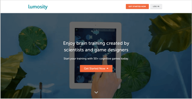
Where am I?
As you can see with all of the landing page examples, the logo is in the top left corner. Immediately you know where you are and within seconds you will know what you can do on this site…
What can I do here?
On Lumosity you can “Enjoy brain training created by scientists and game designers”.
Why should I do it?
Well, you should do it because it has been designed by scientists and game designers, and their are “50+ cognitive games” available.
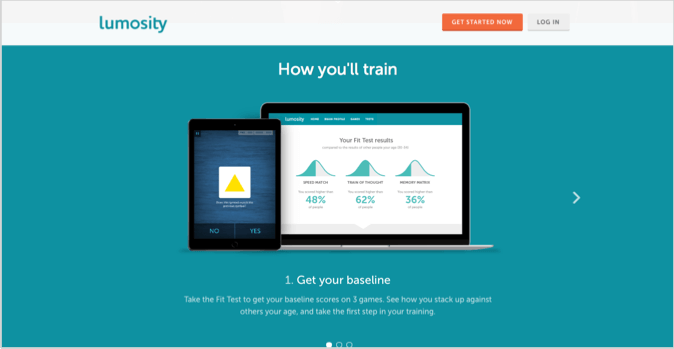
What’s good about this landing page example?
- There are very few distractions above the fold. In fact they have taken away all the top navigation menu items, just leaving you with “Get Started Now” if you are a new visitor, and “Log In” if you are returning.
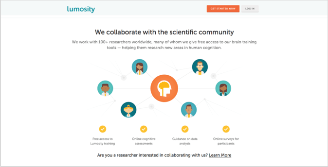
- You will notice immediate proof on this page as it talks about scientists and gamers… Building the credibility of the platform.
- As you scroll down the page there are graphics and visuals for what you will get once you get started.
- You may have noticed on several of the landing page examples in this list the “Floating CTA” has been used. This means visitors can scroll down the page but still have the option of clicking the button they need to, in order to take action.
- And again, there is more proof near the bottom of this page. Lumosity works with “100+ researchers worldwide..”.
7. Hootsuite
Hootsuite is one of the longest standing social media management softwares in the market. The software helps you schedule shares, track results and manage teams across a variety of social media platforms. Below is their primary landing page;
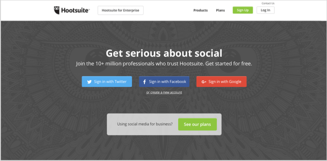
Where am I?
Once again, you can see the Hootsuite logo at the top left of screen on this landing page… If you’re unfamiliar with the company, it doesn’t take long to figure out where you are by reading the front and centre headlines.
What can I do here?
You can “Get serious about social” by logging in or signing up for the service. My only criticism of the headline on this landing page is that it doesn’t let a new visitor know exactly what the software does, and what benefit will come from that. So if you don’t know already what Hootsuite does then you may decide to bounce off the page.
Why should I do it?
You should do it because you will be joining “10+ million professionals who trust Hootsuite”.
What’s good about this landing page example?
- The element of proof above the fold in the sub-headline is one of the first things a new visitor will read. This prominence helps build trust instantaneously with prospects.
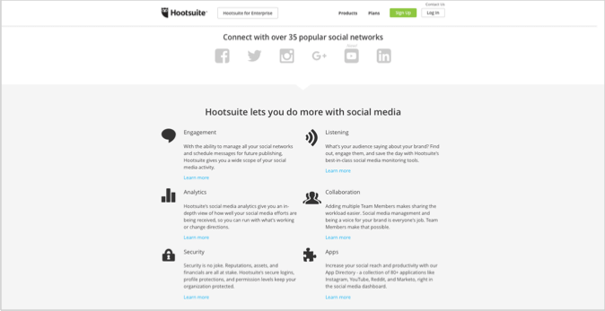
- By scrolling down the page, the “What can I do here?” question is more adequately answered with visually displayed features, and comments about the functionality of the software. The statement “Hootsuite lets you do more with social media” may actually work better as the primary headline on the page, because it is much clearer and benefit driven than the one they have used.
- There is no confusion as to who this page is for, the team at Hootsuite spell it out for you in the next section.

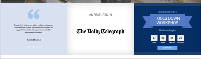
8. Small Fish Business Coaching
Small Fish Business Coaching is an Australian based coaching company for tradies and small business owners. Below is the first page you see after clicking on one of their Google ads;
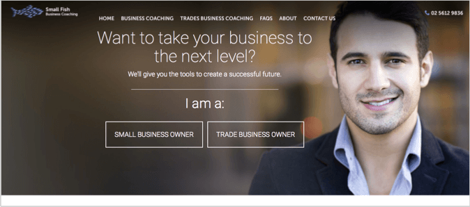
Where am I?
Someone who lands on this page is most likely looking for business coaching, and it’s quick to recognise they are in the right place.
What can I do here?
You can “Take your business to the next level” with business coaching, you just need to choose whether you are a “Small Business Owner” or a “Trade Business Owner”.
Why should I do it?
Small Fish have the “tools to create a successful future” for you… That is the “Why” in this case. To make this an even more compelling landing page they could use proof elements above the fold, which only come later.
What’s good about this landing page example?
- This page identifies their target customers very clearly above the fold, and then immediately after you begin scrolling. By being clear and precise about who you serve, it increases the conversions of that group of people.
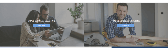
- The natural flow between primary headline and sub-headline is a nice touch. As a general rule the headline should grab your prospects attention and spark curiosity with a clear benefit, then the sub-headline should add to this with more information about the specifics. This page is a great example of that.
- Small Fish have maintained the top navigation for their main site with this landing page, which is great for Google Adwords compliance and trust building. The use of the company phone number in the top right hand corner is also a nice tactic for building trust.
- Towards the end of this landing page comes the proof elements in the form of “As Featured In” and client testimonials. These all contribute to the likelihood that someone will take action, but as I mentioned before, it would improve the page to include at least one of these elements above the fold.
9. Wix
Wix is an easy-to-use website builder for non-techies without coding skills…. Here is their home page;
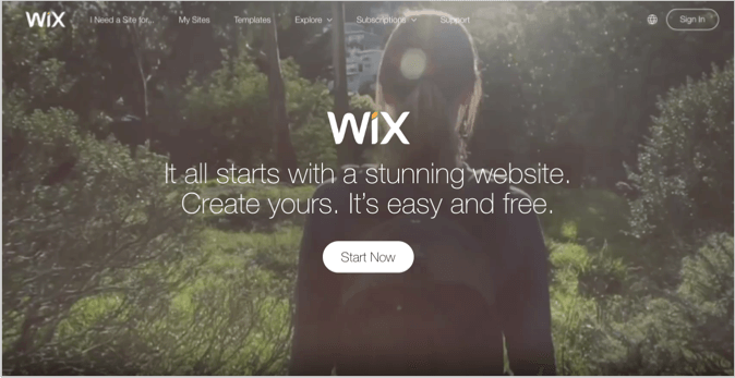
Where am I?
Everything on this page mentions “Sites”… You’ve landed here for a reason, and Wix reinforces that reason quickly.
What can I do here?
You can easily “Create yours.” in relation to a website, all you need to do is click the “Start Now” button.
Why should I do it?
You should create your website with Wix because it’s “easy and free”, that’s their pitch in this initial interaction.
What’s good about this landing page example?
- Wix have made it ridiculously clear what this page is all about. Building websites, plain and simple.
- They have included one prominent CTA, the “Start Now” button in the middle of the screen. This helps visitors make an easy decision.
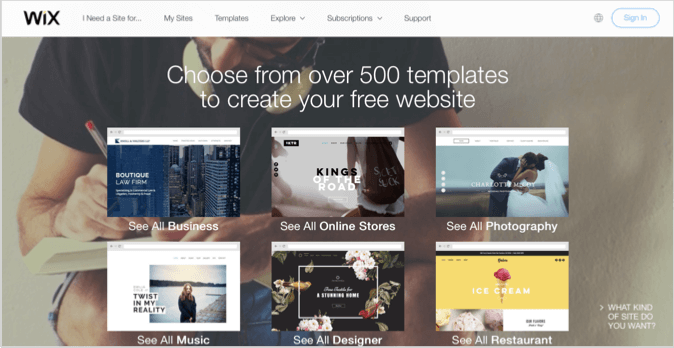
- Social proof shows up as you scroll down the page; “Over 80 million people in 180 countries choose Wix”. That is a pretty compelling stat…. If they’ve done it, maybe you can to? That’s what they are trying to achieve with this statement.

- The next part of the page that works well is the visual section that shows off some of their website templates. They have broken the templates up into categories which also tells you something about their target customers.
10. Bills.com
Bills offers help on mortgages, debts and other financial commitments. Below is the home page;
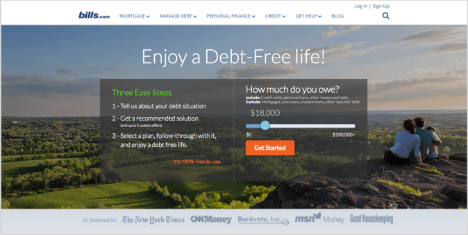
Where am I?
The logo is used again to build trust and let a visitor know where they are. Also, the title of this home page includes a brief description – “Simple Money Help on Mortgages, Debt and More!”
What can I do here?
You can “Enjoy a Debt-Free life” with Bills.
Why should I do it?
You should do it because it’s “100% free to use” and they have been “Featured In” a bunch of cool publications.
What’s good about this landing page example?
- The benefit in the main headline is very specific and it hits a core benefit/pain of their customers.
- It’s obvious what a visitor should do as the next step… “Get Started” by choosing how much debt they currently have, then they will “Get a recommended solution”, and finally they can “Select a plan”. This step-by-step guidance removes uncertainty from the prospects mind, plus it is a simple 3-step process that is unlikely to overwhelm anyone.
- Bills have also included social proof above the fold in the form of the “Featured In” section, this is a great for conversions and trust building.
- One cool element of this landing page which we haven’t seen in the other examples is the use of gamification. The little debt sliding tool on the right hand side of the page is BIG for conversions because it creates a personalised experience for the prospect, and gets them excited about removing that debt from their life.
11. Airtasker
Airtasker is an online marketplace for outsourcing little tasks in your life such as cleaning, lawn mowing or just about anything you can think of. This is their main landing page;
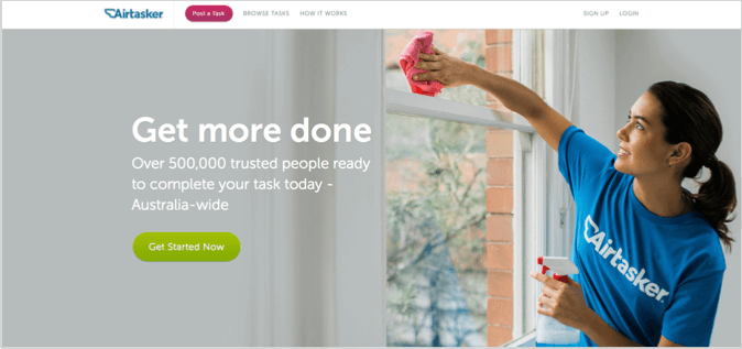
Where am I?
You’re at a site called “Airtasker” where you can “Get more done”… It’s intriguing.
What can I do here?
You can “Get Started Now” by posting a task for someone to do.
Why should I do it?
You should do it because you are eager to “Get more done” in your life and Airtasker has “Over 500,000 trusted people ready to complete your task”.
What’s good about this landing page example?
- The proof element above the fold referring to “500,000 trusted people” is a great start with this page.
- Another interesting component is that it is geo-targeted… You will see it says “Australia-wide” in the subheadline, despite Airtasker being an international website. Personalising the experience by geography can make a visitor feel more at home.
- The hero image at the top of this page is effective because it’s not just a generic stock image of someone cleaning a window, they are wearing an Airtasker T-Shirt. This visual helps build trust and credibility for the brand.
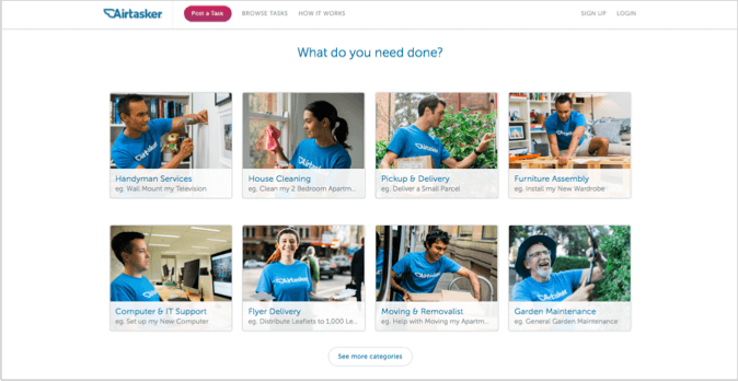
- As you scroll down the page the features of what you can get done at Airtasker are nicely presented with more personalised photos and a clean column design.
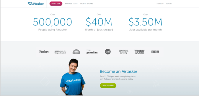
- Then finally, the landing page is wrapped up with multiple proof elements to further boost the brand’s credibility.
12. Property Development System
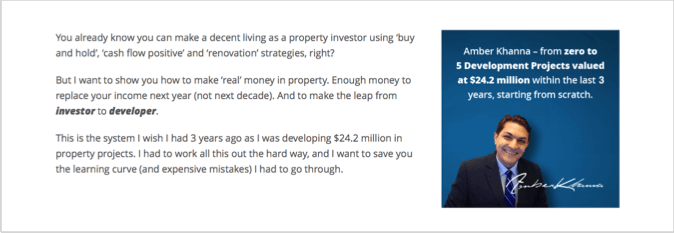
Property Development System is an online training business for property investors. Below is a landing page that we created for the “Property Developer’s Blueprint” one of their lead magnets.
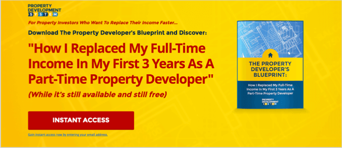
Where am I?
You are at a place for “Property Investors Who Want To Replace Their Income Faster…”
What can I do here?
You can “Download The Property Developer’s Blueprint” by getting “Instant Access”.
Why should I do it?
You should do it because it’s giving you the secrets of “How I Replaced My Full-Time Income In My First 3 Years As A Part-Time Property Developer”.
What’s good about this landing page example?
- The primary headline is benefit driven and time bound. “Replaced My Full-Time Income”… “First 3 Years”.
- There is an element of urgency and scarcity with this page, “While it’s still available”. This encourages people to take action straight away rather than waiting.
- We found that the two-step popup opt-in performed 30% better than an embedded form on the page.
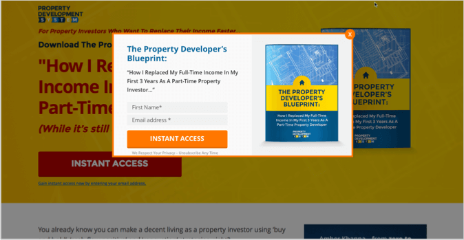
- A photo of the author personalises the page and builds more trust with prospects.
- Highly relevant graphics are used all the way throughout the page.
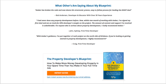
- Social proof is used in the form of testimonials, this increased conversions by 5%.
- There are also multiple CTA buttons as you scroll down, giving visitors more chance to take action.
13. Open Universities
Open Universities is an online alternative to the traditional university system in Australia. This is their home page;
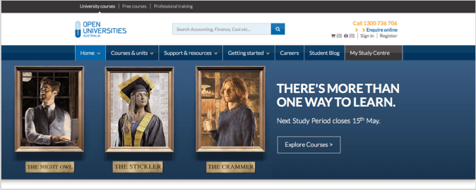
Where am I?
At a university website where their are courses available – the logo and use of strategically placed “Course” text illustrates this.
What can I do here?
You can “Explore Courses”.
Why should I do it?
Because there is “More Than One Way To Learn”.
What’s good about this landing page example?
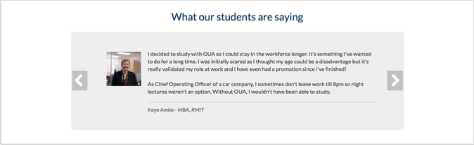
- The target personas are identified really clearly above the fold, and given character names and faces; “The Night Owl”, “The Stickler” and “The Crammer”.
- Why “Open Universities” is uniquely different to other alternatives is spelled out in the next section.
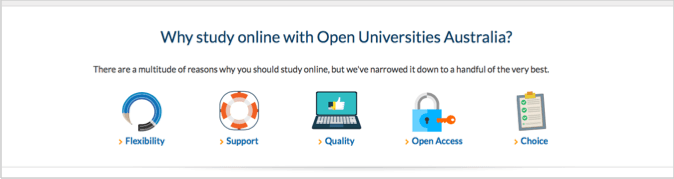
- The use of consistent graphics and clear next steps creates design consistency and a sense of journey for the visitor.

- Social proof comes in the form of student testimonials towards the bottom of the page.
14. The 4-Hour Workweek
The 4-Hour Workweek was a book written by Tim Ferriss that talks about productivity, automation and outsourcing. His website and accompanying blog, podcast and TV show is one of the most respected sites in the world. Here is his home page;
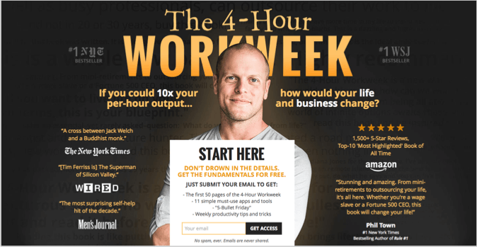
Where am I?
It’s hard to avoid looking at Tim’s face and the supporting headline behind it when you land on this page… You know where you are straight away.
What can I do here?
You can “Get Access” to “The first 50 pages of the 4-Hour Workweek”, “11 simple must-use apps” and “Weekly productivity tips”.
Why should I do it?
You should do it because you could “10x your per-hour output…” and trusted sources such as the New York Times, Amazon and the Wall Street Journal agree.
What’s good about this landing page example?
- The benefit is very specific, everything is about “output” and productivity. So if you want that, then you are in the right place.
- This page is packed with lots of proof elements. Testimonials, reviews and big-brand logos.
- The list of what you will get right above the email form submission helps visitors decide if it’s right for them.
- Tim’s photo personalises the experience, builds trust and leverages his credibility.
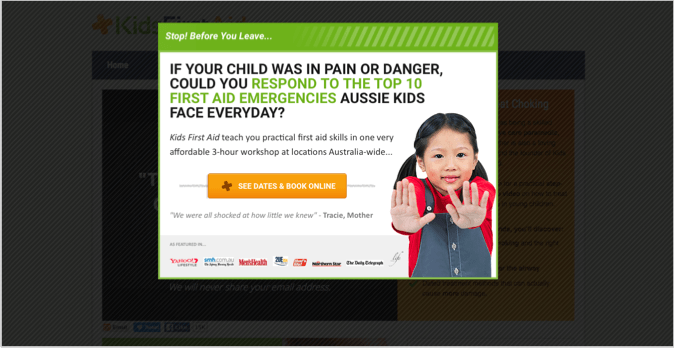
15. Kids First Aid
Kids First Aid is a business founded to help parents deal with medical emergencies… Below is a landing page we created for them that has a gated video of “The Right Way To Treat Choking In Children”. Visitors can only watch the video by giving up their email address.
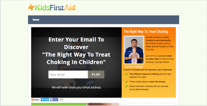
Where am I?
On a website that is all about “Kids First Aid” and how to prevent choking.
What can I do here?
This one is super-obvious… Enter Your Email To Discover “The Right Way To Treat Choking In Children”.
Why should I do it?
You should do it because you’re a parent, and one of your children choking is kind of scary… So it’s not as necessary to emphasise the pain here, it’s very clear to the visitor. However, the use of words such as “The Right Way” and “Dated treatment methods”, as well as positioning the presenter as a “skilled intensive care paramedic” all contribute to the “Why” in this case.
What’s good about this landing page example?
- The headline is prominent, and the text and bullet points are benefit driven.
- The video content is gated using the Wistia overlay functionality… This little tweak helped us increase conversions significantly on this page, compared to using a basic opt-in form and then providing the video afterwards.
- Social proof and trust building comes in the form of testimonials at the bottom of the page and a brief bio for the presenter.
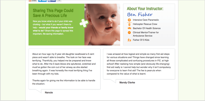
- One final component of this page which has helped with conversions is the exit intent popup once someone decides to leave the page. It sends them to one of the “money pages” on the site where they can register for a more complete first aid course. These popups are great for pushing prospects further down the marketing funnel.
16. Shopify
Shopify is an all-in-one eCommerce platform for online businesses. I’ve chosen to show their main landing page below;
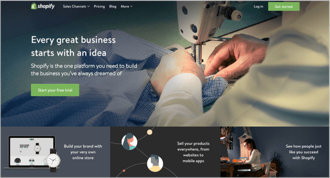
Where am I?
Straight away you can figure out where you are… At “Shopify” a place you can bring your business idea to life.
What can I do here?
“Start a free trial” is the primary CTA in this example. My only concern with the headline combination is that it is a little generic. It would be more obvious if it mentioned keywords such as “online store” or “sell products online” rather than talking generally about starting a business.
Why should I do it?
You should do it because you can “Sell your products everywhere, from websites to mobile apps” and “Shopify is the one platform you need”.
What’s good about this landing page example?
- The primary CTA is very clear and positioned strongly in the middle of the screen as well as in the top right corner. The CTA is also a brand congruent colour that stands out from the page.
- The use of photos and graphics along the bottom panel plays well with the look and feel of the site, and is consistent with the message they are trying to convey.
- Proof is there in terms of the “See how people just like you succeed with Shopify”… but it would be better to include a few quotes on the actual page, rather than encouraging people to click elsewhere.
- The benefits of “your very own online store” and “sell your products everywhere” are good additions, but could be more prominently featured in the main headline.
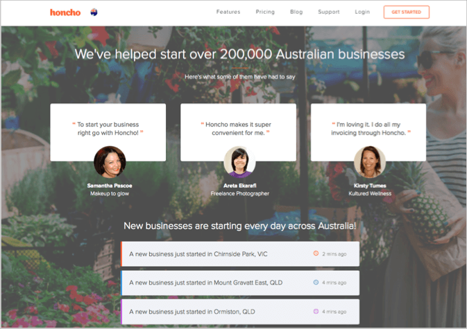
17. Honcho
Honcho offers the services you need to start a new business, everything from registration to marketing.
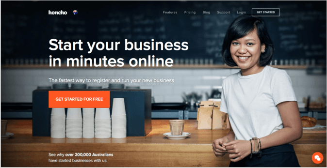
Where am I?
You are at a site that is going to help you start a business fast.
What can I do here?
You can “Start your business in minutes online” for free by clicking the orange button.
Why should I do it?
You should do it because Honcho is “The fastest way to register and run your new business” and “Over 200,000 Australians have started businesses with us”.
What’s good about this landing page example?
- Much like Airtasker, Honcho have used geo-targeting throughout the page to illustrate that they are helping “Australian” businesses specifically, even though they operate in multiple countries.
- The headline and sub-headline are very clear in this example and they nicely connect together. There’s no guessing as to what you can do with this site.
- The orange CTA button is front and centre, as well as being brand congruent.
- On top of the primary CTA they also have a floating button in the top right corner that turns orange as you scroll.
- The statement “A new business just started 9 minutes ago in…” is great for urgency and FOMO (fear of missing out).
- Further down the page Honcho has a set of guarantees and badges that build trust and encourage action.
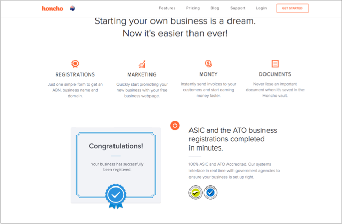
- Finally, the social proof elements come hard and fast towards the end of this page with testimonials and big take up numbers.
Conclusion
Have you ever heard the saying “There is no perfect science to it”…
Well when it comes to landing pages, that’s not quite true.
Sure there are subtleties to each unique business, and without proper testing you can never be sure if something will work. But the elements of a high-converting landing page are always going to be very similar.
It’s like a scientific formula when we build landing pages for clients, we start with a checklist of conversion elements. And then over time that formula improves as the individual elements are tested and optimised.
But if you’re not a conversion expert and you just want to make more money from your landing pages, take some inspiration from these examples. And ask yourself, if a visitor has landed on my site, can they quickly and easily figure out where they are, what they can do and why they should do it?
If your landing pages pass this acid test, then you’re off to a great start.
If you want something more comprehensive, contact our team to see how we can help out.